Vanta Interactive Branding
PC * Mobile * Web | 2024-Present
Learn about the new changes to the brand
Brand Guidelines
Typography
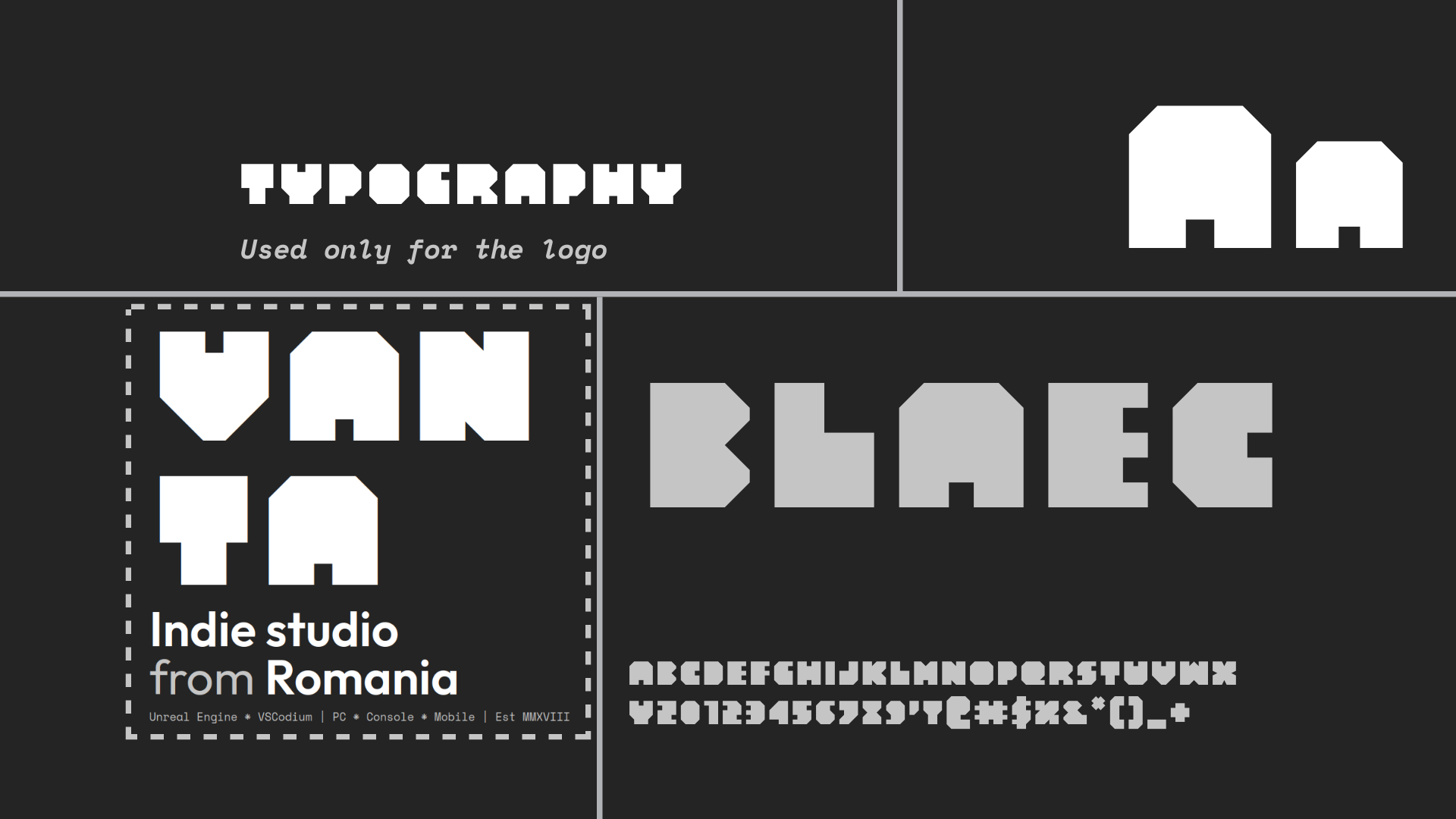
Primary Font: Blaec is exclusively used in the logo, because of the big, bold, uppercase font face. This creates a simple, yet reusable and recognizable logo that can be used in any situation, while ensuring it’s readable.
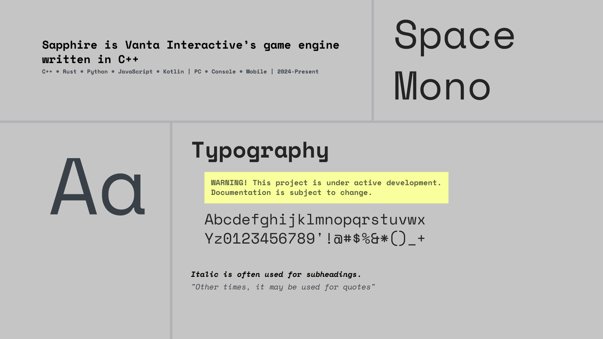
Secondary Font: Space Mono. All Vanta Interactive websites heavily use Space Mono, due to the industrial, retro-futurist ‘NASA-like’ design evoked by the font, that also complements our brand colors.
Tertiary Font(s): Outfit and DM Sans are used interchangeably for the header buttons, post titles and other elements that benefit from increased readability.
Usage:
- Blaec should be used exclusively for the logo.
- Space Mono is recommended for blog posts, documentation, and other textual content.
- Outfit or DM Sans can be used interchangeably for header buttons and other elements where readability is paramount.
Project-specific typography
Each project within Vanta Interactive may utilize its own typefaces to reflect its unique identity and aesthetic. Bold fonts are recommended for logos to attract attention, while regular fonts should align with the project’s theme and visual style, and should nicely complement the font used for the logo. These typefaces can be used in the projects themselves, documentation, news pages, social media posts, banners and other use cases where the project is represented.
Examples:
- Project Odyssey using FAT and Molot: Red background with white Blaec VANTA text
- Project Mountain using Bebas Neue: Light green background with white Blaec VANTA text
- Project Jailbird using Kiloton: Bright orange background with white VANTA text and a thick black border
Colors

Shapes







Logo
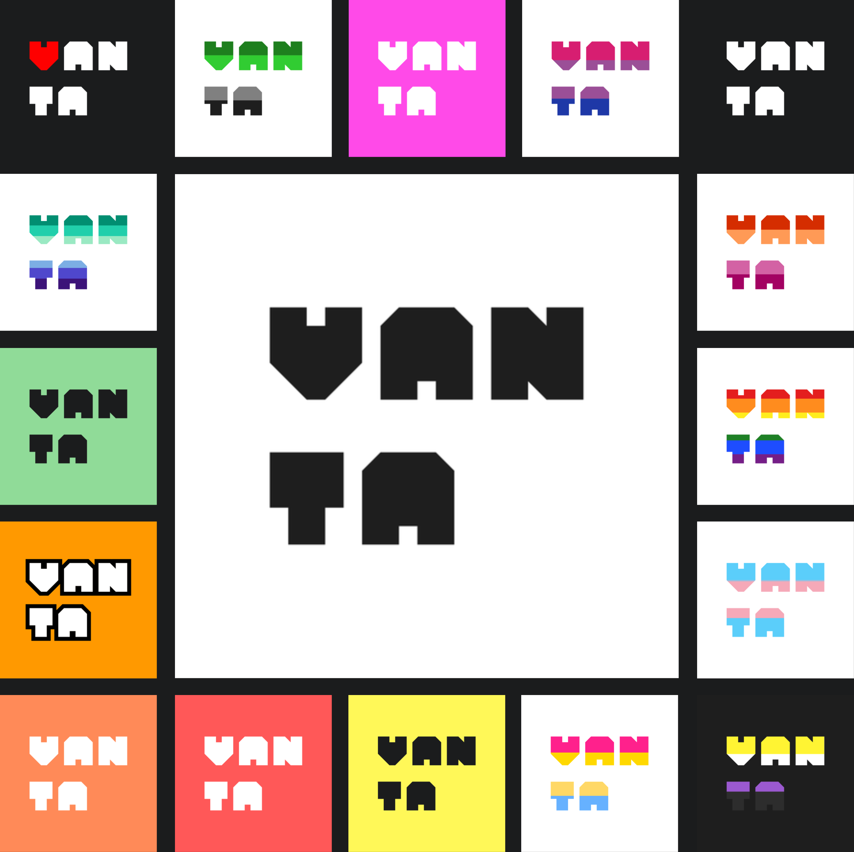 Our logo is the cornerstone of our brand identity. It features the distinctive, double-line “VANTA” text in the Blaec font, with deliberate space left out to the right, to evoke a sense of openness and possibility - symbols can be used to fill the empty space, for example. The design resembles a vertical half of an upside-down pyramid, symbolizing our studio’s forward-thinking approach and holistic view of our projects. We refer to the upside-down pyramid as a Panopticon, as it’s the ‘control center’, the heart of Vanta Interactive.
Usage:
- The logo should be displayed prominently in all official communications, marketing materials, and digital platforms.
- Maintain the integrity of the logo by using authorized color variations, including white text on black background, black text on white background, and variants with accent colors specific to each project.
- Ensure sufficient clear space around the logo to maintain visibility and impact.
At Vanta Interactive, we proudly support diversity and inclusivity. As an indie studio founded and led by someone who is part of the GSRM1 community, we are deeply committed to fostering a welcoming and affirming environment for all individuals.
We offer variants of our logo with GSRM flag colors and other customizations to support and affirm various causes and events.
-
GSRM - Gender, Sexual, and Romantic Minorities; may be used as an equivalent acronym to LGBTQIA+. ↩
